Case Study
Apertured: Illuminating the Human World!
5 - Minute Read
Quick Links
- Overview
- Goals: A Seamless Luxury Online
- The Challenges
- Branding
- Website Design & Development
- Marketing
Services we offered
Branding
UX Design
Behavioral Design
Website Development
Conversion Rate Optimization
Lead Generation
SEO / PPC
Social Media Marketing
OVERVIEW
Crafting a Brand from the Ground Up!
This case study outlines the comprehensive creation of Apertured, a large distribution agency specializing in delivering world-class lighting solutions for motion and still photography. Recognizing the pivotal role that lighting plays in cinematic experiences—illustrated by films like "Avatar," which uses vibrant blue hues to evoke emotion, and "The Nun," known for its suspenseful lighting—we embarked on a transformative journey to establish a compelling brand identity for Apertured.
Innovate & Drive Value
Check out our case studies to see real-world applications and outcomes, in the industry.
Goals
Understanding the goals and challenges.
Our primary objective was to create a robust brand identity that effectively communicated the essence of lighting while appealing to both industry professionals and consumers. The challenge was to design a logo and branding elements that not only encapsulated the core attributes of light but also resonated with a diverse audience, ranging from filmmakers to photographers. Balancing creativity with functionality was essential to ensure the brand's identity would stand out in a competitive market.
The Challenges
Crafting Apertured's Identity: From Concept to User-Approved Design.
Brand Identity Creation
Creating a distinctive brand identity from the ground up required developing a logo that encapsulated the fundamental qualities of lighting. This process involved extensive research, brainstorming, and conceptual design to capture the multifaceted nature of light.
Conceptual Design
The challenge was to design an innovative logo that not only reflects Apertured's mission but also engages viewers on an emotional level. The logo needed to be versatile enough for various applications, from digital platforms to print media, while maintaining its core message of light and illumination.
User Acceptance Testing
To ensure that the logo and branding elements were easily understandable, memorable, and appealing to the target audience, we implemented a rigorous testing phase. Gathering feedback from real users was crucial to refining the designs and ensuring that they resonated well with potential users.
Color Selection
Identifying a color palette that embodies the brand's values while connecting emotionally with the audience was critical. This involved exploring the psychological effects of colors and their implications in the context of lighting, ensuring that the chosen palette would support the brand's narrative.
1/BRANDING
Efficient marketing strategies for maximum ROI.
Creating a Brand Narrative
The branding process began with a deep dive into the significance of the term "apertured," derived from "aperture," the adjustable lens opening that controls the light entering a camera. This connection highlighted the vital role that lighting plays in photography and film, establishing a strong foundation for the brand narrative.
Concept Development: Collaboratively brainstormed and refined logo concepts that reflect the brand's mission.
User Acceptance Testing: Engaged a targeted user group to gather insights and feedback on logo clarity and appeal, ensuring that the final design resonated with the intended audience.
Logo Design Refinement: Iterated on the initial concepts based on user feedback to enhance overall effectiveness, memorability, and emotional connection with the audience.
Logo Concepts Developed:
Concept One: A celestial arrangement of six lights, symbolizing the key qualities of lighting: Color, Brightness, Diffuse, Direction, Specular, and Contrast. This design emphasized Apertured's commitment to universal storytelling, reflecting its mission to enhance visual narratives through innovative lighting solutions.
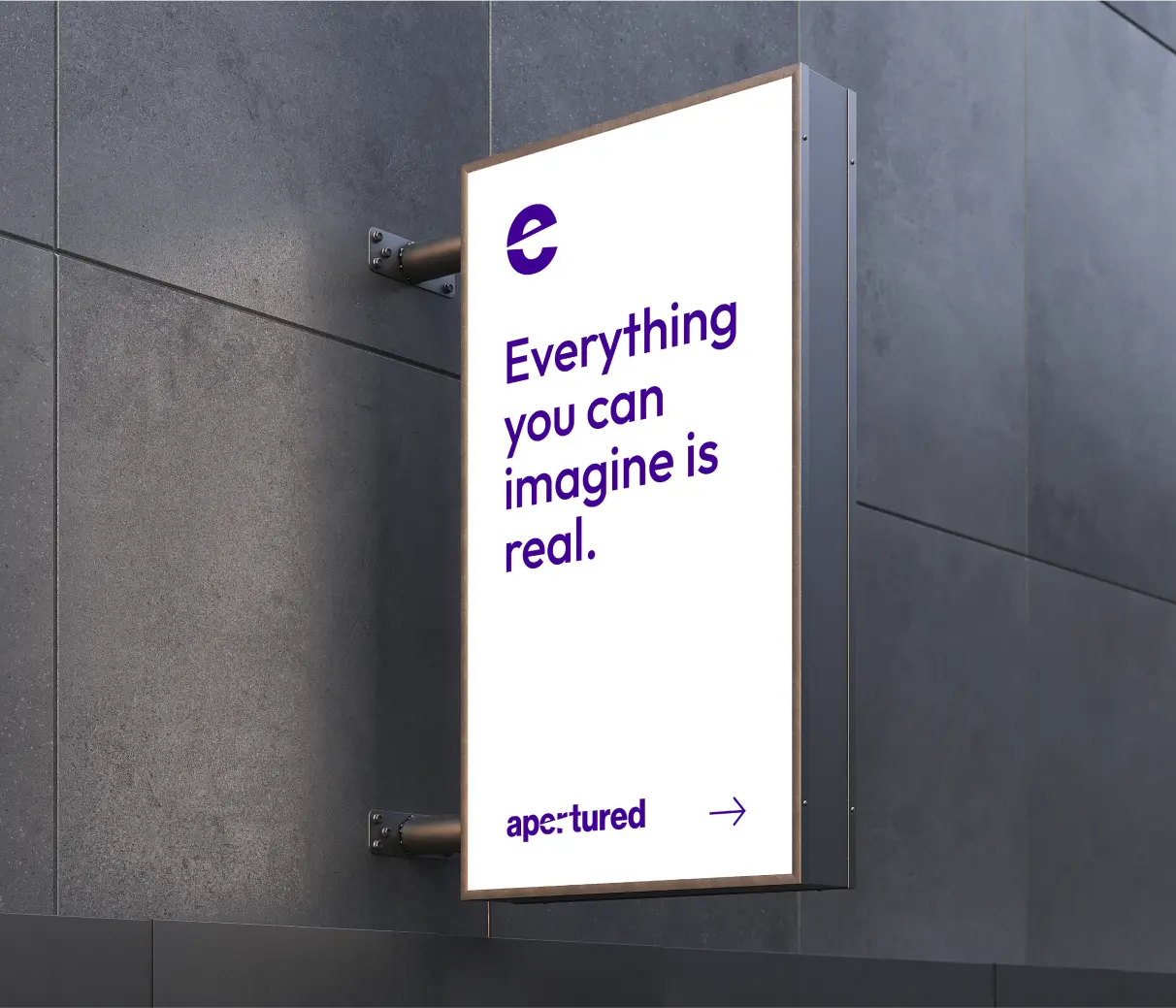
Concept Two: A dynamic logo featuring a light flash emanating from the letter "P," illuminating the letters "e," "r," and "T," collectively forming the word "Perfect." This concept visually illustrated the aspiration for achieving cinematic excellence through superior lighting.
Concept Three: An artistic interpretation of the letter "A," shaped like a softbox, which confines and directs light. Two elevated shapes symbolize wide distribution, reinforcing Apertured's promise of illuminating every scene.
Color Selection : Choosing Colors That Resonate
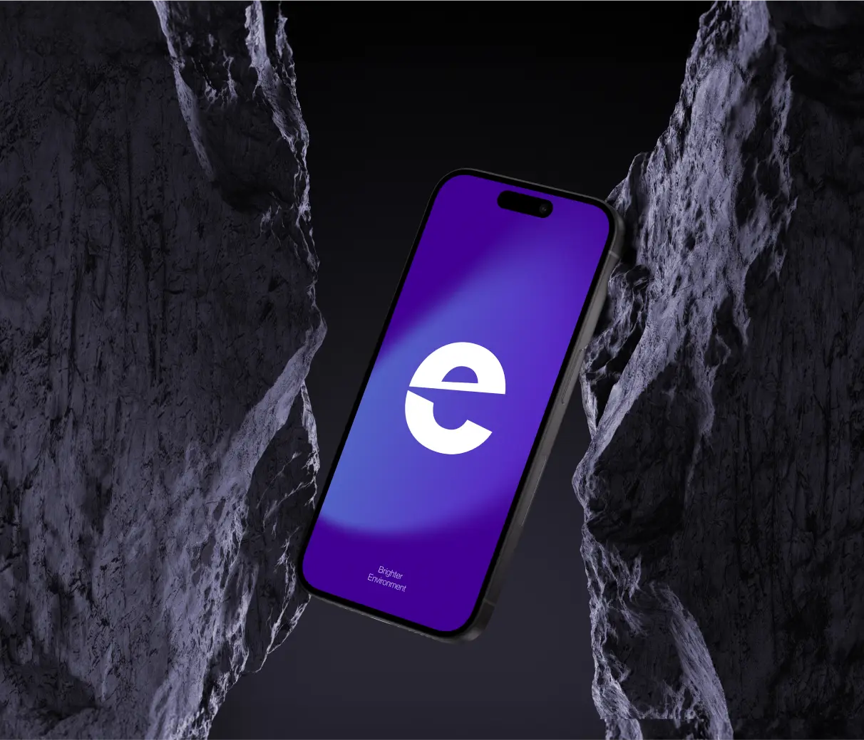
The process of selecting brand colors involved a deep exploration of the emotional and psychological effects of different hues, particularly in the context of lighting and visual storytelling. We drew inspiration from the VIBGYOR spectrum, ultimately selecting Indigo (#410093) as the primary brand color. This deep hue evokes the depth of the night sky, symbolizing power, dignity, and reflection—qualities that align perfectly with the brand's identity.
Color Palette Development: Curated a color palette that aligns with the brand’s identity and values, ensuring it was suitable for a wide range of applications, from digital to print media.
Gradient Exploration: Experimented with gradient applications to enhance the brand's visual identity, providing a modern touch that appeals to contemporary audiences. Gradients were strategically used to evoke emotional responses and add depth to the visual representation of the brand.
Brand Identity Development
Transforming Concepts into Reality
The brand identity development process focused on integrating the brand’s vision into every aspect of its identity, from the logo to marketing materials. We aimed to create a positive emotional connection between Apertured and its audience, ensuring that every touchpoint with the brand resonated with its core message.
Comprehensive Communication Strategy: Developed a communication strategy that articulated Apertured's mission and values, ensuring consistency across all platforms and materials.
Client Collaboration: Maintained open communication with the client throughout the design process, ensuring alignment with world-class design standards. This collaborative approach fostered creativity and ensured that the final brand identity was a true reflection of Apertured's essence.
2/WEBSITE DESIGN & DEVELOPMENT
Building a Digital Presence That Shines.
Building a Digital Presence That Shines.
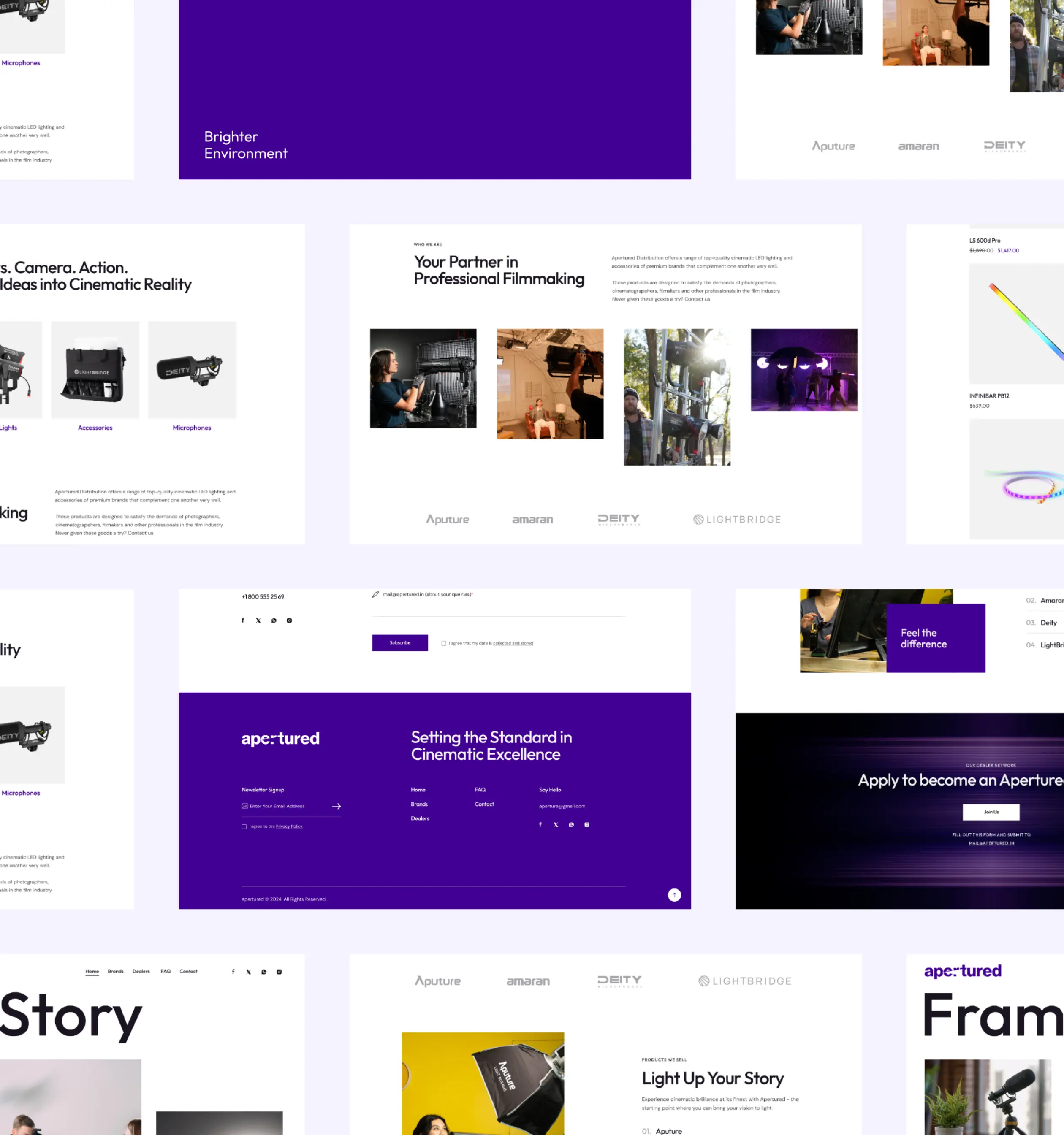
Developing a website for Apertured was about more than just functionality; it was about creating a digital experience that reflected the brand's commitment to quality and innovation in lighting solutions. The website needed to be a visual extension of the brand, offering a seamless and engaging experience for users.
What Did We Do?
Custom Website Design: Designed a website that captured the brand’s identity, using the selected color palette and logo designs. The layout was crafted to highlight Apertured’s products and services while providing a user-friendly experience.
Content Development: Created compelling content that reinforced the brand narrative, emphasizing the importance of lighting in visual storytelling and Apertured’s role in this industry.
User Acceptance Testing: Conducted rigorous testing to ensure that the website was intuitive, easy to navigate, and visually aligned with the brand’s identity.
3/ MARKETING
Extending the Brand into the Market.
To support Apertured's launch and ongoing marketing efforts, we developed a range of marketing materials that extended the brand’s identity into the marketplace. These materials were designed to be versatile and impactful, ensuring that they could be used across a variety of platforms and formats.
What Did We Do?
Brochure Design: Created an informative and visually appealing brochure that highlighted Apertured’s offerings, targeting both industry professionals and consumers.
Business Cards: Designed business cards that were both elegant and functional, ensuring that they left a lasting impression on potential clients and partners.
Digital Marketing Assets: Developed digital assets for use in online campaigns, including banners, social media graphics, and email templates, all aligned with the brand’s visual identity.
Impact
Illuminating a New Path in the Lighting Industry!
The team successfully set up a full-service fundraising platform for Afghanistan relief the same weekend as the US withdrawal. The transformation enabled U4U to personalize outreach better and mobilize US dollars for refugees more efficiently. And by the end of 2021, U4U raised nearly $65 million for refugee aid everywhere, a 4.7% uptick from 2020 totals.
Frequently Asked Questions
Consumers have been through the wringer—but they’ve been resilient. They’ve found creative ways to adapt to Talk With US
Jawhara Jewellery recognized the growing trend of online shopping and the need to adapt to this shift. The digital transformation aimed to provide an online shopping experience that mirrors the luxury and sophistication of their physical stores while ensuring global accessibility and ease of use.
Related Insights